A Frequency Distribution in SPSS allows you to summarize and analyze the distribution of categorical or continuous variables. It provides insights into how often each value or range of values occurs in a dataset. Frequency distributions offer benefits such as clear data overview, pattern identification, and aiding in further analysis. They help identify central tendencies, spread, and potential outliers. Thus, a frequency distribution is a table that summarizes the number (or frequency) of items in each of several nonoverlapping classes (Bowerman et al., 2019). Researchers can use frequency distributions in SPSS for better insights and informed decision-making, enhancing their understanding of data. A Frequency Table is a statistical tool that categorizes qualitative data into distinct, exhaustive classes, displaying the number of observations in each class (Lind et al., 2022). Using the example of a group of 120 army members who have had their blood types tested, Table 1 below demonstrates how to calculate the frequency distribution.
Table 1. Frequency Distribution
| Blood Types | Frequency (f) | Relative Frequency | Percentage (%) |
|---|---|---|---|
| A | 28 | =28/120 = 0.233 | = (28/ 120) * 100 = 23.30% |
| B | 17 | =17/120 = 0.142 | = (17 / 120) * 100 = 14.20% |
| AB | 30 | =20/120 = 0.250 | = (20 / 120) * 100 = 25.00% |
| O | 45 | =45/120 = 0.375 | = (45 / 120) * 100 = 37.50% |
| Total | n=120 | 1.00 | 100% |
Summary
The table shows that blood type O is the most common among the sample, followed by AB, A, and B. The relative frequencies and percentages provide additional insight into the proportion of each blood type within the population.
Section 1. Formula
- Relative Frequency
$$Relative\;Frequency\;=\frac{A\;frequency}{Total\;of\;Frequency\;(n)}=\frac{28}{120}=\mathbf0\boldsymbol.\mathbf{233}$$ - Percentage
$$Percentage\:(\%)\;=\frac{A\;frequency}{Total\;of\;Frequency\;(n)}x\;100\;=\frac{28}{120}=\mathbf0\boldsymbol.\mathbf{233}\boldsymbol\;\boldsymbol x\boldsymbol\;\mathbf{100}\boldsymbol\;\boldsymbol=\boldsymbol\;\mathbf{23}\boldsymbol.\mathbf{30}\boldsymbol\%$$
Or
$$Percentage\:(\%)\;=Relative\;Frequency\;x\;100\;=\frac{28}{120}=\mathbf0\boldsymbol.\mathbf{233}\boldsymbol\;\boldsymbol x\boldsymbol\;\mathbf{100}\boldsymbol\;\boldsymbol=\boldsymbol\;\mathbf{23}\boldsymbol.\mathbf{30}\boldsymbol\%$$
Section 2. Graphics
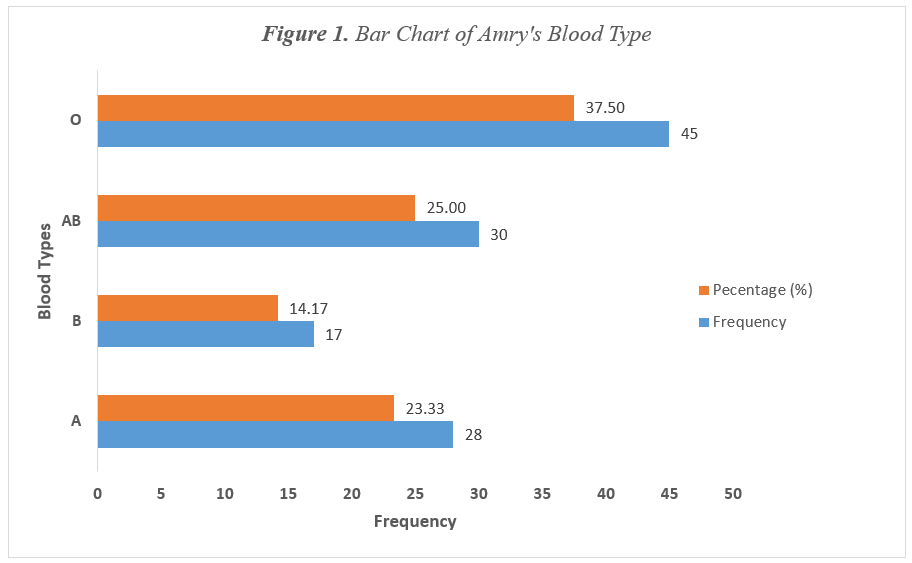
1. Bar Chart (i.e., Table 1)
A bar graph represents the data by using vertical or horizontal bars whose heights or lengths represent the frequencies of the data (Bluman, 2023). The result of Figure 1 indicated that among the 45 army of 120 who have blood group O, 38% have This indicates that army units need to keep a larger supply of this type of blood on hand to treat potential injuries.

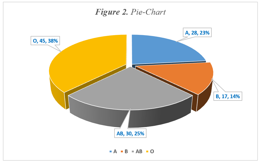
2. Pie Chart (i.e., Table 1)
A pie chart is a statistical graphic divided into slices, representing a category’s contribution to the dataset, allowing visual comparison of different categories (Bowerman et al., 2019). The result of Figure 2 (produced by Excel) indicated that among the 45 army of 120 who have blood group O, 38% have This indicates that army units need to keep a larger supply of this type of blood on hand to treat potential injuries.

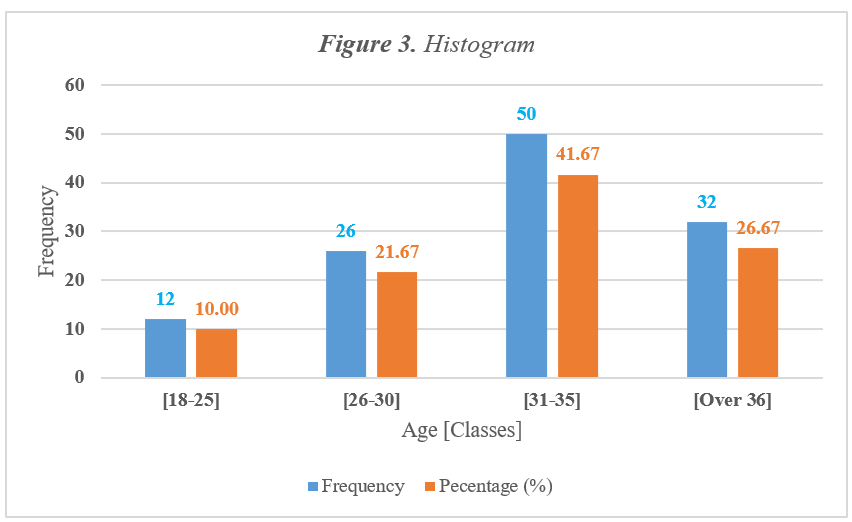
3. Histogram
The histogram is a graph that displays the data by using contiguous vertical bars (unless the frequency of a class is 0) of various heights to represent the frequencies of the classes (Bluman, 2023). According to Table 2 and Figure 3 (produced by Excel), the study found that 41.67% of the sample, or 50 out of 120 individuals, fall within the age group of 31-35 years old.
Table 2. Age Group of Army
| Age | Frequency | Relative Frequency | Percentage (%) |
|---|---|---|---|
| [18-25] | 12 | 0.100 | 10.00 |
| [26-30] | 26 | 0.217 | 21.67 |
| [31-35] | 50 | 0.417 | 41.67 |
| [Over 35] | 32 | 0.267 | 26.67 |
| Total | 120 | 1.00 | 100 |

Section 3. Definition of Technical Words
Frequency the number of times a particular value or event occurs within a dataset. In statistics, it is used to indicate how often an element appears, which helps in understanding the distribution and patterns within the data. Frequency is often represented in tables, charts, or graphs to make data analysis clearer and more accessible. For example, if you have a list of blood types among 120 people, the frequency of blood type A might be 28, indicating that 28 people have this blood type.
The relative frequency of a class is the proportion (fraction) of the total number of measurements that are in the class (Bowerman et al., 2019).
Percentage a way of expressing a number as a fraction of 100. It is denoted by the symbol “%”. Percentages are used to describe proportions, compare quantities, and convey rates or ratios in an easily understandable format.
For example, if 25 out of 100 students in a class prefer a certain subject, you can say that 25% of the students prefer that subject. Percentages are widely used in various fields such as finance, statistics, and everyday life to express increase or decrease, calculate discounts, and compare data.
A bar graph represents the data by using vertical or horizontal bars whose heights or lengths represent the frequencies of the data (Bluman, 2023).
A pie chart is a statistical graphic divided into slices, representing a category’s contribution to the dataset, allowing visual comparison of different categories (Bowerman et al., 2019).
The histogram is a graph that displays the data by using contiguous vertical bars (unless the frequency of a class is 0) of various heights to represent the frequencies of the classes (Bluman, 2023).
Part I. Step-by-Step Guide for Frequency Distribution in SPSS
Creating frequency distribution in SPSS is a straightforward process that allows you to summarize and analyze the distribution of categorical or continuous variables. Here’s a step-by-step guide to help you generate frequency distributions in SPSS:
Step 1: Open Your Data File
- Launch SPSS on your computer.
- Open your dataset by clicking on File > Open > Data and selecting the appropriate .sav file.
Step 2: Access the Frequencies Function
- In the top menu, click on Analyze.
- Hover over Descriptive Statistics.
- Select Frequencies from the dropdown menu.
Step 3: Select Variables
- In the Frequencies dialog box, you will see a list of variables on the left.
- Select the variable(s) for which you want to create a frequency distribution and move them to the Variable(s) box using the arrow button.
Step 4: Configure Options (Optional)
- If you want to display additional statistics, click on the Statistics button to check options like mean, median, mode, etc. (though these are less common for frequency distributions).
- If you want a graphical representation, click on the Charts button:
- Choose the type of chart (e.g., bar chart or pie chart) and configure options as desired.
- Click Continue once you have selected your options.
Step 5: Run the Analysis
- Once you have configured your variables and options, click OK to run the frequency distribution analysis.
Step 6: Review the Output
- The output window will display the frequency distribution table for the selected variable(s).
- The table will include columns for the values, frequencies, valid percentages, and cumulative percentages.
- If you chose to generate charts, these will also appear in the output window.
Step 7: Interpret the Results
- Review the frequency distribution table to understand the distribution of values:
- Identify the most common values and their frequencies.
- Examine patterns, such as skewness or outliers, if applicable.
- Use the charts for a visual representation, enhancing the understanding of the data distribution.
Part II. Tutoring for Frequency Distribution in SPSS
5. References
1. Bowerman, B. L., Hummel, R. M., Drougas, A. M., Moninger, K. B., Duckworth, W. M., Schur, P. J., & Froelich, A. G. (2019). Business statistics and analytics in practice (9th ed.). McGraw-Hill Education.
2. Bluman, A. (2023). Elementary Statistics: A step by step approach 9e (11th ed.). McGraw Hill.
3. Lind, D. A., Marchal, W. G., & Wathen, S. A. (2022). Statistical Techniques in Business & Economics (13th ed., Vol. 12). McGraw-Hill.

Leave a Reply